Picture this: You’re browsing the web, searching for information or looking to make a purchase. Suddenly, you’re faced with a website that looks like it’s been trapped in a time warp. Garish colors assault your eyes, text is barely readable, and you can’t figure out how to navigate to the information you need. You’re not alone in this digital nightmare.
On the internet, some websites stand out for all the wrong reasons. They’re the digital equivalent of a store with broken windows, flickering lights, and products scattered haphazardly. These sites aren’t just unappealing – they’re actively driving potential customers away.
But what exactly makes a website cross the line from mediocre to memorably bad? And more importantly, how can these design disasters be transformed into effective digital platforms? Lets talk
What Makes a Website’s Design Bad?
User Experience Failures
Labyrinthine Navigation
A website becomes a nightmare when users feel lost in a maze of menus and subpages. If finding information feels like solving a puzzle, it’s a clear sign of poor design.
Sluggish Load Times
In our fast-paced digital world, every second counts. Websites that take ages to load are not just frustrating—they’re actively driving users away and hurting search engine rankings.
Unresponsive Design
With the multitude of devices used to access the web, a site that doesn’t adapt to different screen sizes is stuck in the past and alienating a significant portion of its potential audience.
Visual Design Disasters
Cluttered Chaos
When a website resembles a digital hoarder’s paradise, with every pixel crammed full of information, it’s a visual overload that repels rather than engages.
Color Scheme Calamities
Colors that clash, lack contrast, or strain the eyes are more than just unappealing—they can make the content unreadable and drive users away in frustration.
Typography Tragedies
Font choices that prioritize quirkiness over readability, or a jumble of mismatched typefaces, can turn what should be informative text into an eye-straining ordeal.
Content and Functionality Flops
Outdated Information
Nothing says “We don’t care” quite like a website that hasn’t been updated since flip phones were cutting edge. Outdated content erodes trust and relevance.
Broken Links and Features
A site riddled with 404 errors and non-functioning elements is like a road full of potholes—users will quickly seek a smoother journey elsewhere.
Accessibility Oversights
Ignoring the needs of users with disabilities isn’t just bad design—it’s exclusionary and potentially illegal in many jurisdictions.
SEO and Performance Pitfalls
Search Engine Invisibility
A beautifully designed site is worthless if it’s invisible to search engines. Poor SEO practices can relegate a site to the digital equivalent of a ghost town.
Security Shortcomings
In an era of increasing cyber threats, a site that doesn’t prioritize user data security is a ticking time bomb of potential disasters.
Analytics Ignorance
Failing to implement or utilize web analytics is like driving blindfolded. Without data on user behavior, improving the site becomes a game of chance.
1. Cluttered Layout: Yahoo!
Yahoo’s homepage is a prime example of digital clutter gone wild. What was once a pioneering web portal now resembles a chaotic flea market, where every vendor is shouting for attention. Users are greeted with a dizzying array of headlines, images, and ads, all competing for their limited attention span. It’s like trying to find a specific book in a library where all the shelves have been emptied onto the floor.
What Went Wrong
- Information overload: A digital hoarder’s paradise
- Tiny text: Squint or lose out on content
- Ad invasion: More pop-ups than a whack-a-mole game
How to Fix It
- Declutter: Marie Kondo the homepage
- Font size boost: No more squinting required
- Content diet: Trim the fat, keep the muscle
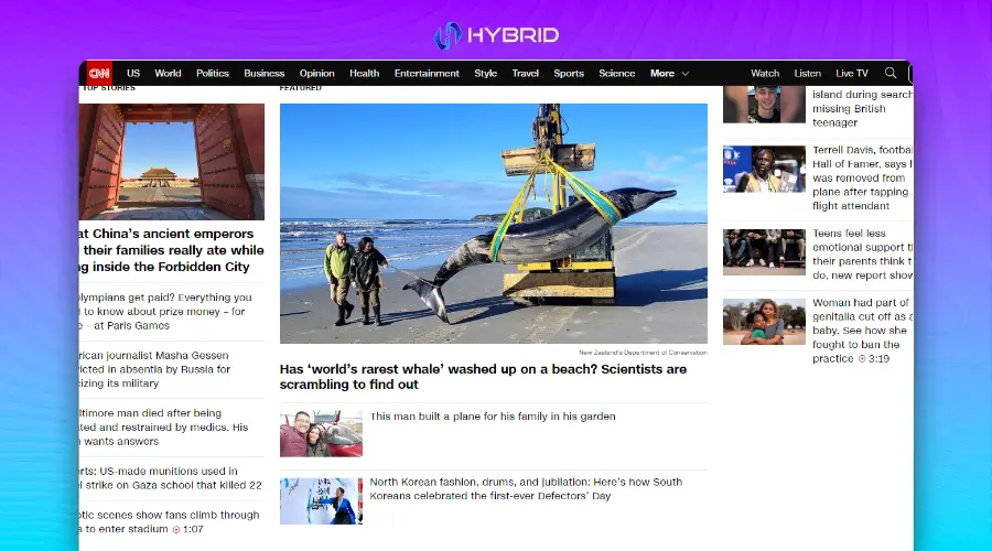
2. Slow Loading Time: CNN
CNN’s website is the digital equivalent of a traffic jam. While it aims to deliver breaking news at lightning speed, the site itself moves at a snail’s pace. This sluggishness isn’t just annoying – it’s a news emergency. In a world where information travels at the speed of light, CNN’s website feels like it’s still using dial-up.
What Went Wrong
- Heavyweight champion: Pages heavier than a sumo wrestler
- Media mayhem: Video autoplay party no one asked for
- Optimization oversight: Running a marathon in flip-flops
How to Fix It
- Slim down: Put those pages on a strict diet
- Lazy loading: Let content hit the gym before showing up
- Speed tuning: Swap those flip-flops for running shoes
3. Poor Navigation: Hacker News
Navigating Hacker News feels like trying to decipher an ancient manuscript. While beloved by tech enthusiasts for its content, the site’s design seems to have been frozen in time. It’s a digital archaeologist’s dream but a regular user’s nightmare. The bare-bones approach might appeal to coding purists, but for the average visitor, it’s about as intuitive as a maze designed by M.C. Escher.
What Went Wrong
- Hierarchy havoc: Where’s Waldo, but with important info
- Microscopic links: Needle in a haystack simulator
- Time warp design: Stuck in the digital stone age
How to Fix It
- Clear signposts: Guide users like a GPS
- Clickable comfort: Make those links pop
- Modern makeover: Bring the site into this century
4. Inconsistent Branding: New Century Chamber Orchestra
The New Century Chamber Orchestra’s website is a visual cacophony that would make even the most avant-garde composer wince. Like a musician playing out of tune, the site’s inconsistent branding hits all the wrong notes. Visitors are left wondering if they’ve stumbled onto multiple websites rather than a single, cohesive brand experience.
What Went Wrong
- Color chaos: A palette as mixed as a preschooler’s paint set
- Shade roulette: Playing fast and loose with brand hues
- Identity crisis: More split personalities than a psych ward
How to Fix It
- Color harmony: Conduct a visual symphony
- Consistency key: Paint the town (your brand color), every time
- Brand unification: Give your site a cohesive makeover
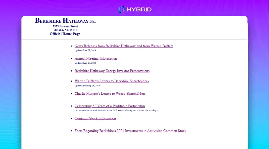
5. Information Overload: Berkshire Hathaway
Berkshire Hathaway’s website is the digital equivalent of trying to drink from a fire hose. It’s as if they’re determined to share every piece of information they’ve ever collected, all on one page. This approach might work for Warren Buffett’s brain, but for the average visitor, it’s like trying to read “War and Peace” in one sitting – overwhelming and likely to induce a headache.
What Went Wrong
- Text tsunami: War and Peace, but make it finance
- Hierarchy? What hierarchy?: Where everything is important, nothing is
- Time capsule design: A website that remembers dial-up fondly
How to Fix It
- Modern minimalism: Less is more, even in finance
- Information architecture: Build a skyscraper, not a sprawl
- Digestible data: Serve information in bite-sized chunks
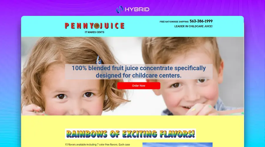
6. Poor Responsive Design: Penny Juice
Penny Juice’s website is like a juice box that doesn’t fit in your cup holder – frustrating and likely to make a mess. In an age where people browse everything from smartwatches to 4K monitors, this site stubbornly refuses to play nice with different screen sizes. It’s the digital equivalent of trying to pour a gallon of juice into a shot glass.
What Went Wrong
- Mobile Mayhem: Where pinch-to-zoom is a full-time job
- Layout lottery: Different devices, different disasters
- Tiny text terror: Giving ants a reading advantage
How to Fix It
- Responsiveness: Flex those layout muscles
- Unified experience: One site to rule them all (devices)
- Mobile-friendly makeover: From squint-worthy to thumb-friendly
7. Confusing User Flow: Arngren
Navigating Arngren’s website is like trying to find your way through a crowded flea market during an earthquake. It’s a digital hoarder’s paradise where products are stacked higher than a Jenga tower on the verge of collapse. Visitors aren’t browsing; they’re surviving a visual assault that would make even the most seasoned Internet explorer reach for the back button.
What Went Wrong
- Product pandemonium: Where’s Waldo, but with gadgets
- Structure? What structure?: A digital version of your junk drawer
- Visual vertigo: More images than a year’s worth of Instagram posts
How to Fix It
- Category cleanup: Sort that junk drawer into labeled boxes
- User journey mapping: Create a path even Hansel and Gretel could follow
- Content curation: Quality over quantity, even in e-commerce
8. Outdated Design: Space Jam
The Space Jam website is a time capsule from the era of dial-up internet and boy bands. While it might spark nostalgia for some, for most users it’s like trying to use a flip phone in the age of smartphones. It’s not just outdated; it’s prehistoric in internet years.
What Went Wrong
- ’90s nightmare: When neon colors and Comic Sans ruled the web
- Space wasted: More gaps than a first-grader’s smile
- Web standards? Never heard of her: HTML from the Jurassic period
How to Fix It
- Retro refresh: Keep the charm, lose the eyesore
- Responsive retrofit: Make it flex like a ’90s workout video
- Space optimization: Fill those gaps with more than just stars
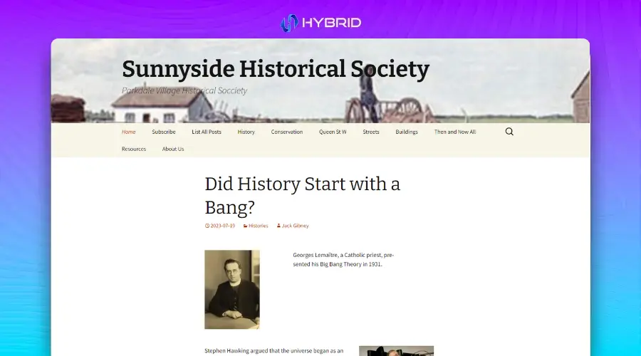
9. Lack of Visual Appeal: PVHS.info
PVHS.info is the web design equivalent of beige wallpaper in a windowless room. It’s not just bland; it’s aggressively uninteresting. This site could make even the most exciting school events seem as thrilling as watching paint dry. It’s a masterclass in how to make visitors click away faster than you can say “school spirit.”
What Went Wrong
- Color scheme: Fifty shades of boring
- Visual vacuum: As engaging as an empty chalkboard
- Typography tragedy: Words that don’t just speak, they mumble
How to Fix It
- Color revolution: Inject some life into those pixels
- Visual vitamins: Add some eye candy that’s actually nutritious
- Font facelift: Make those letters stand up and be counted
10. Confusing Navigation: Ling’s Cars
Ling’s Cars website is like a Las Vegas casino designed by a committee of sugar-high toddlers. It’s a riot of color, animation, and confusion that would make even the most psychedelic ’60s rock posters seem tame. Navigating this site isn’t just difficult; it’s an extreme sport.
What Went Wrong
- Sensory overload: More flashing lights than Times Square on New Year’s Eve
- Navigation nightmare: A maze where the walls keep moving
- Hierarchy? LOL: When everything screams for attention, nothing gets heard
How to Fix It
- Design detox: Cut the visual caffeine by about 90%
- Navigation GPS: Create a roadmap even a drunk GPS could follow
- Information architecture: Build a pyramid, not a ball pit
There are just so many sites that we can share in one go. And these are some of the more famous ones, so many are telling you design mistakes. But if you are a Small Business in Seattle and you want to see if your site is doing something wrong then just get in touch with us. We provide free initial consultation after that if you decide to work with us, We are the best Web Design Agency in Seattle. Fill out the form or just give us a call directly and we can discuss it there. See you on the other side!


